A Beginner’s Guide to Mastering UI Design: Crafting User-Friendly Interfaces
. understand basics of UI design
UI Design is mostly just about making screens that people can use easy. Like, it’s how someone click, tap or scroll through stuff on a app or site. It’s kinda the bridge between what a person wanna do and what the software lets them do.
It goes hand in hand with UX design too. Like, UI is more the visuals and clicky parts, and UX is how smooth and fun the whole thing feels. Think like this: UI is the fancy outside of a car, and UX is how comfy and safe the ride feels when you drive it.
. Key Principles of UI Design
If u wanna make a clean, usable interface, here’s some things to keep in your head:
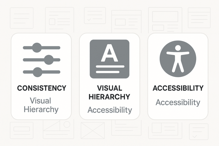
Keep Stuff Consistent: Same buttons, same colors, same fonts make users feel less confused. It’s like givin’ them a map that always works.
Make Important Things Pop: Titles big, bold and clear. Use spacing and size to show what matters.
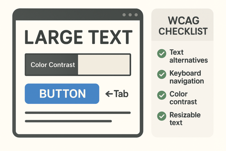
Don’t Forget Accessibility: Not everyone can see or use stuff the same. Colors, sizes, and how people move through the page matters A LOT.
. Tools of the Trade
You gonna need some tools to start buildin:
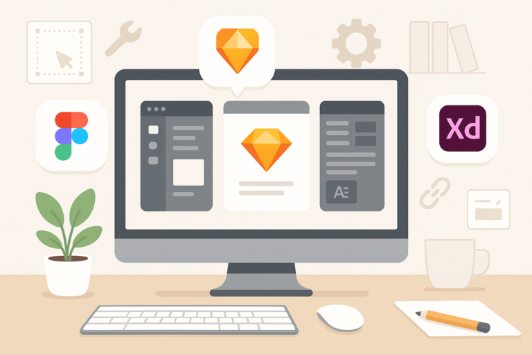
Sketch: Vector design tool, kinda clean but only for Mac mostly.
Figma: Free, easy, and people can work on same file at once. Super useful.
Adobe XD: Works with other Adobe stuff, kinda pro level.
Honestly, pick one and play with it. YouTube helps tons. Figma’s free version is enough to get your hands dirty.
2. Essential Design Elements
. Colors and Typography
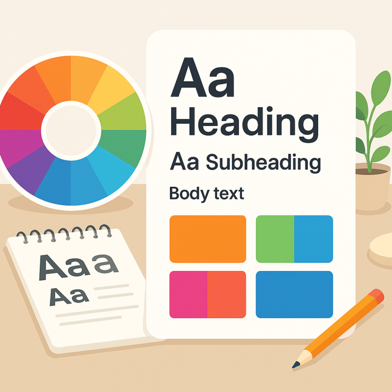
Color and fonts really change how stuff feels.
Color Basics: Use color wheel to see what colors go together nice. Don’t just slap colors anywhere.
Font Choices Matter: Readable fonts with different weights and size can help people know what’s headline and what’s small text.
Make it Easy to Read: Dark text on light background usually works. Contrast is key or users bounce real fast.
. Layout and Spacing
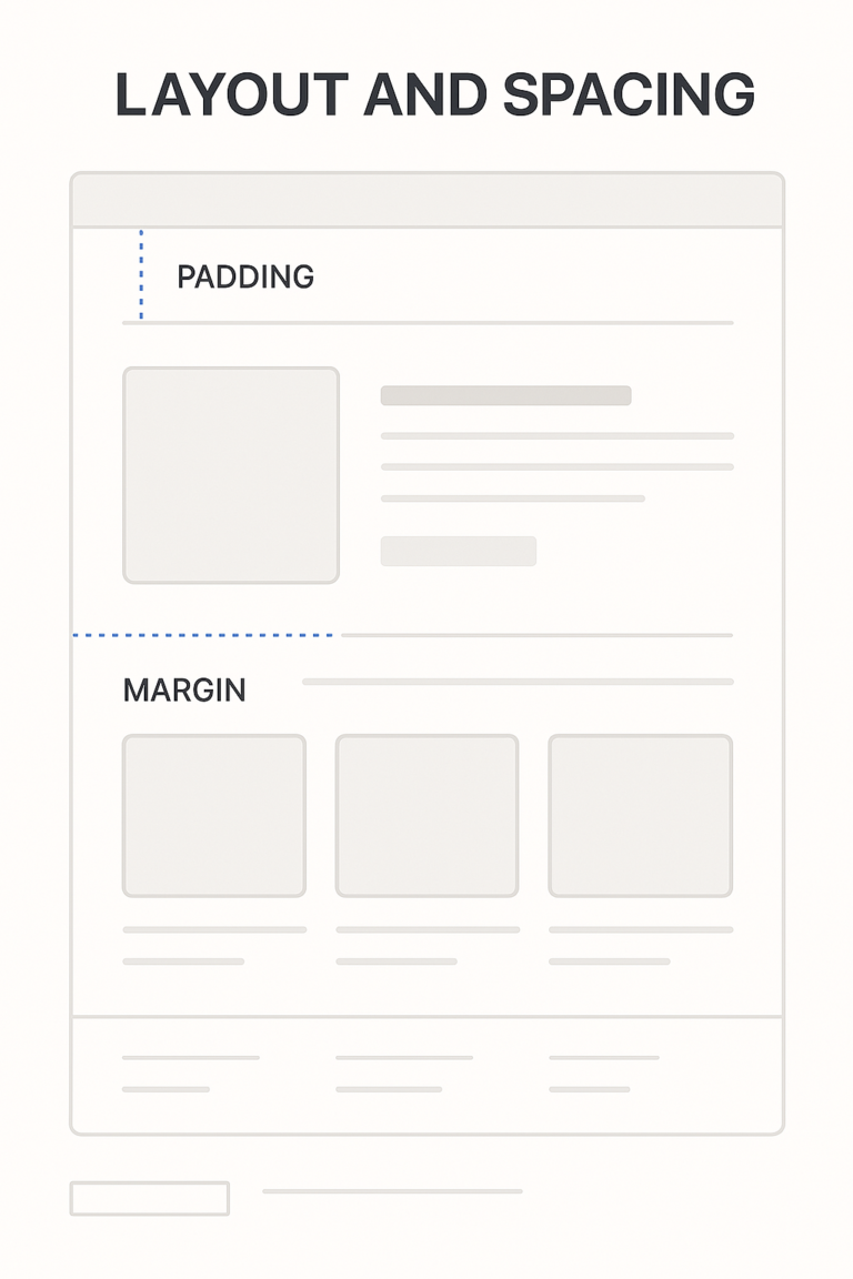
The way stuff’s placed makes or breaks your design.
Grid is Life: Use grids to line stuff up. Chaos ain’t cute.
Space is Important: Don’t let stuff touch each other too much. Give some breathing room.
Mobile Friendly Always: More people on phones now, so design gotta look good on small screen too.
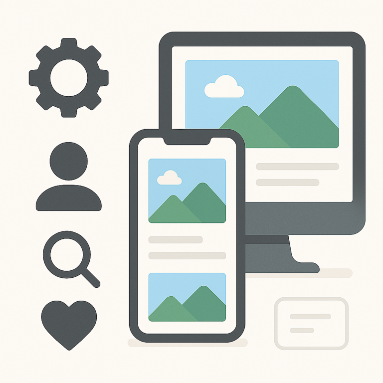
. Icons and Images
These can talk without using words.
Icons Explain Fast: Trash can = delete, right? Use common stuff people recognize.
Good Images Only: Blurry or huge file pics slow the site. Compress it or use better ones.
Highlight Actions: Make buttons like “Buy Now” or “Submit” stand out real good.
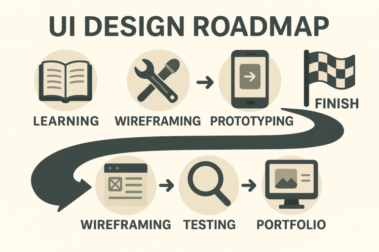
3. Creating Wireframes and Prototypes
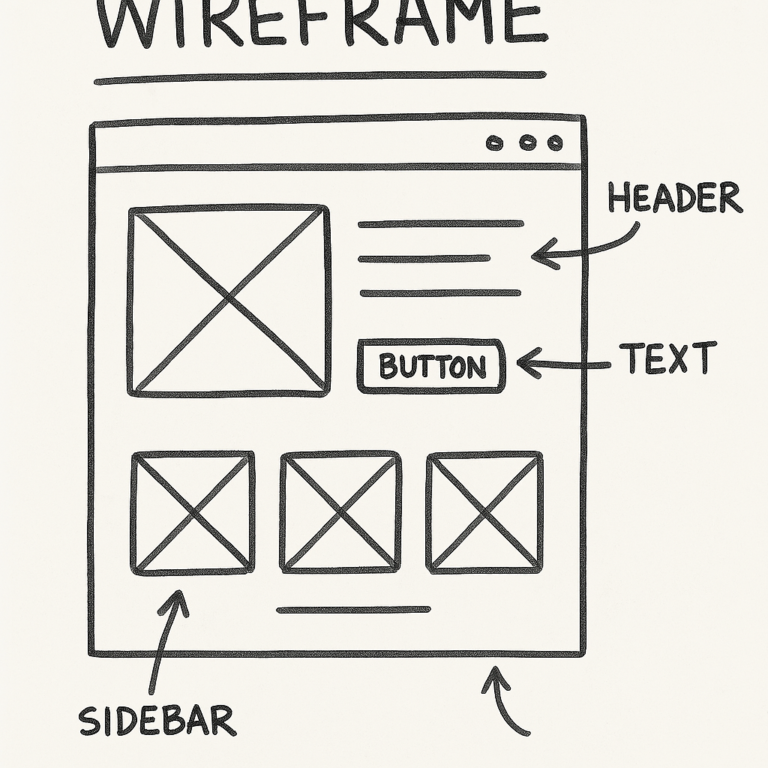
. Importance of Wireframing
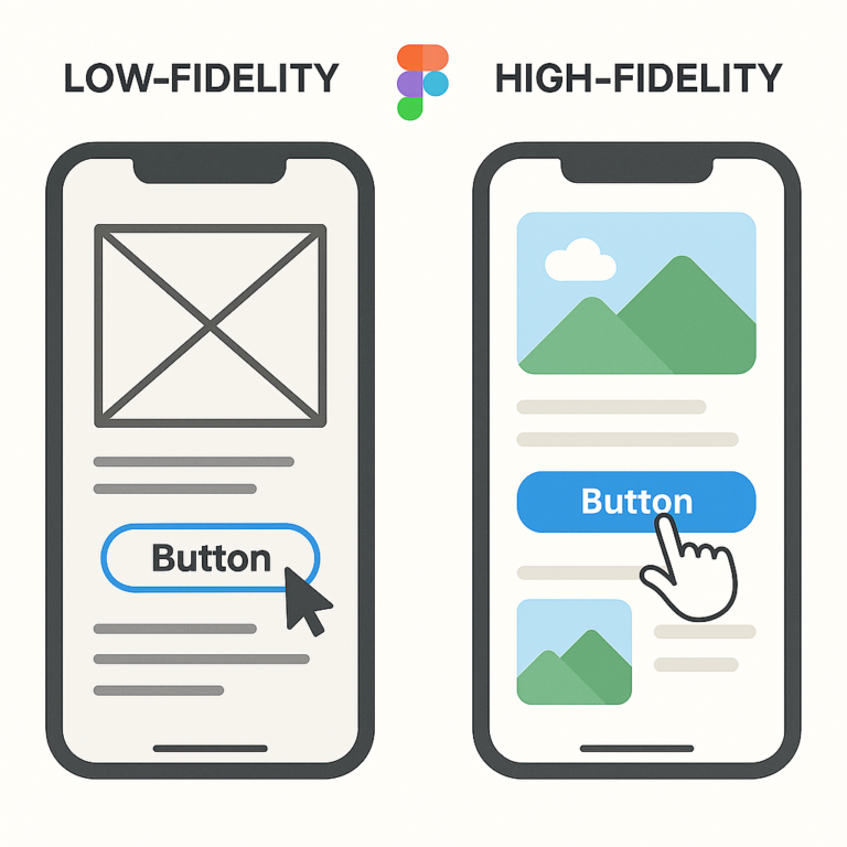
Wireframe is like the sketch before the painting.
What’s a Wireframe? Just blocks that show what goes where. No colors, no real pics, just the layout.
Include Core Stuff: Buttons, nav bars, image holders—all the basics.
Use Tools or Paper: Can use Balsamiq or just draw it out. Doesn’t matter.
Make It Clickable: Figma lets you click through pages. Great for showing how it works.
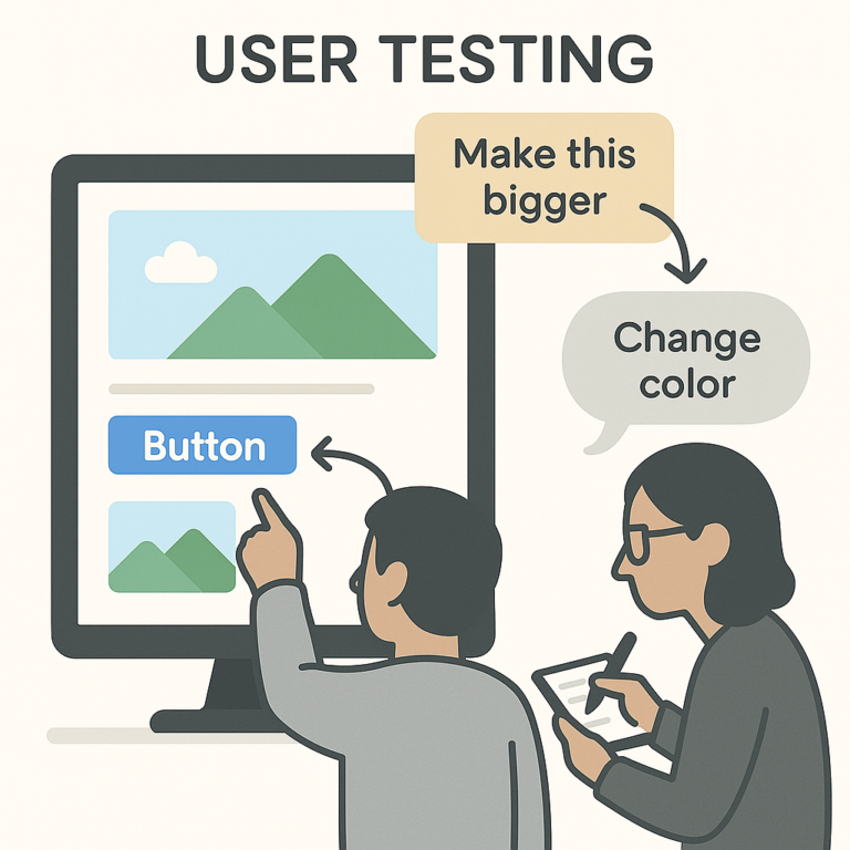
Test It Out: Give to real users. Watch how they use it and where they get stuck.
. Iterating on Feedback
Feedback = gold.
Ask Real People: Surveys, interviews, whatever works. Get people’s thoughts.
Fix the Issues: Don’t be scared to change things. Even tiny changes help.
Think About Users and Business: It’s not just about looking good, it gotta help the biz too.
4. Best Practices for UI Design
User-Centered Design Approach
Make it for the people who gonna use it.
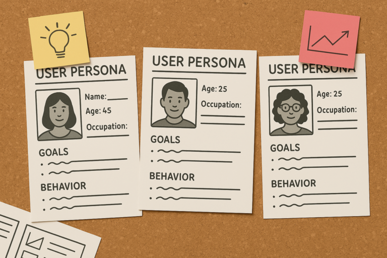
Know Who They Are: Create user personas. Like “Busy Mom” or “College Student”—helps you focus.
Ask Them Stuff: Quick polls, small interviews—whatever you can.
Keep Improving: Just keep listening and adjusting. It never ends really.
Ensuring Accessibility
Don’t leave people out.
All People Should Use It: Blind, colorblind, old—everyone matters.
Know the Rules: Look up WCAG rules. They helpful.
Check with Tools: WAVE or Axe can tell if your design passes basic checks.
Keeping Up with Trends
Trends can be fun, but careful.
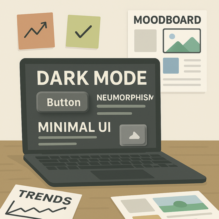
See What’s Hot: Neumorphism, glassmorphism, dark mode, etc. Look into it.
Don’t Force It: Just cause it’s cool don’t mean it works for your project.
Follow Creators: Check out other designers on Insta or Dribbble for inspo.
5. Building Your Portfolio and Gaining Experience
. Crafting a Strong Portfolio
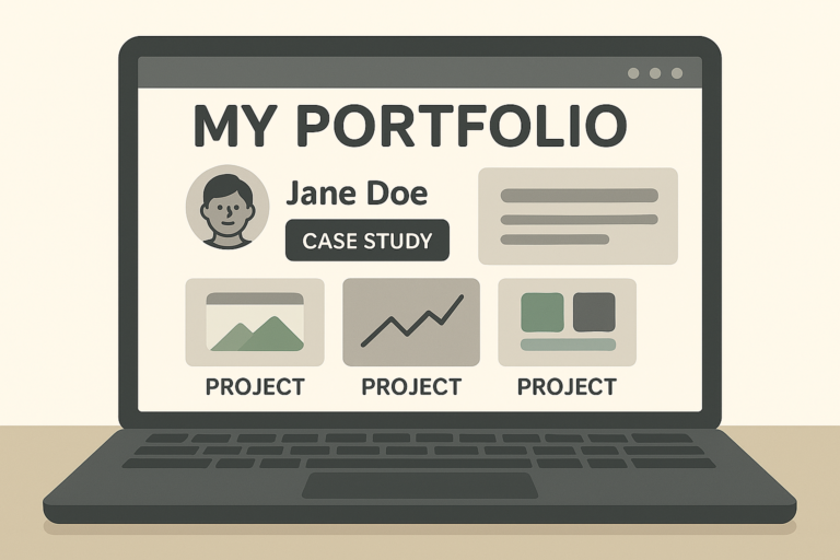
Your portfolio = your resume.
Showcase Stuff: Side projects, college stuff, anything. Doesn’t have to be from a job.
Tell the Story: Don’t just drop screenshots. Show the problem you solved.
Be You: Make your style show. Add a bit of personality.
. Gaining Practical Experience
Start somewhere, anywhere.
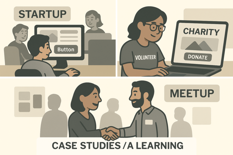
Try Interning: Even unpaid ones help a lot when you’re just startin out.
Volunteer Your Skillz: Help nonprofits or friends with their projects.
Meet Other Designers: Go to meetups, join Slack groups, just talk to people.
. Continuing Your Education
It don’t stop at first job.
Take Online Classes: Stuff like Coursera or Skillshare is useful.
Go to Events: Even virtual workshops are cool to meet new folks.
Be in Design Groups: You learn faster when you talk to others who been through it.
Summary
UI design ain’t just about how pretty the screen look. It’s more about helping people do stuff easy and smooth. Learn the basics, keep experimenting, show your work, and you’ll get there sooner than you think.
FAQs
What’s the difference between UI and UX?
UI is how it looks, UX is how it feels. Simple.
How long does it take to get good?
Few months if you go steady. Keep at it, don’t quit.
Do I need a degree for this?
Nope. Tons of designers self-taught. Your portfolio speaks louder than any paper degree.